
Insights · · 3 min read
Hotel Website Design: What Actually Gets You Bookings
Most hotels hand 15–25% of every booking to an OTA. That's not a marketing expense — it's a tax on having a website that doesn't convert. A hotel website that wins direct bookings pays for itself faster than almost any other investment you can make. So what separates a site that books from one that just looks pretty?
Guests arrive mid-decision, not at the start of it
By the time someone lands on your site, they're usually comparing three to five properties. They already know roughly where they want to stay and what they want to spend. Your site has maybe thirty seconds to answer the questions they're actually asking.
- What do the rooms really look like — honest photos, not just the best corner of the best suite
- What does it cost — visible rates or a booking widget within one tap, not a “call us for pricing” wall
- Where exactly is it — a map, nearby landmarks, travel times, not just a postal address
- Can I trust it — real reviews, recognisable booking flow, a property that clearly exists
- How do I book — obvious, persistent path to reserving a room from every page
Direct booking is the whole point
Every booking that comes through your own site is commission you keep. But guests default to OTAs because OTAs are frictionless — your booking flow has to match that ease. An embedded booking engine, a clear best-rate promise for booking direct, and a WhatsApp or phone fallback for guests who'd rather ask a human first.
Speed and mobile are not optional extras
Most hotel research happens on phones — often literally while travelling. A gallery of uncompressed five-megabyte photos is the difference between a booking and a bounce. Modern image formats, lazy loading and real testing on mid-range phones over hotel-wifi-grade connections are the unglamorous work that decides whether the design ever gets seen.
The trust signals that close the gap
- Real guest reviews visible on the site — not a curated quote from 2019
- Honest photography — oversold rooms create refunds and one-star reviews
- Clear policies — cancellation, check-in times, what's included. Ambiguity reads as risk
- A human path — phone and WhatsApp visible, because some guests still want to ask before they commit
The takeaway
A hotel website is a booking machine first and a brochure second. Everything — the photography, the layout, the words — exists to move a visitor from “this looks nice” to “booked”. We've built hotel sites on exactly these principles — the linked case study shows what it looks like in practice.
See it in practice
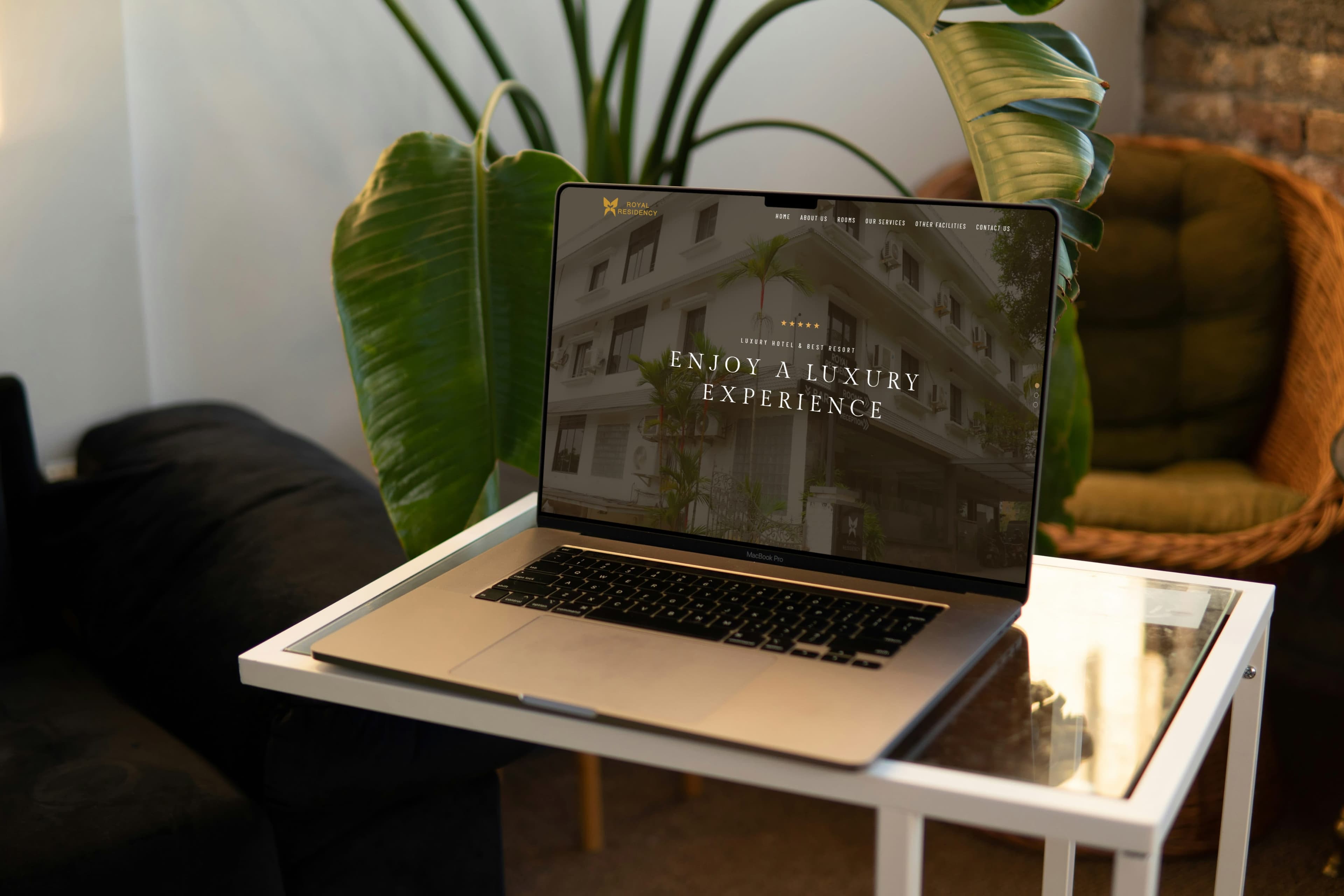
Royal Residency — a luxury hotel website we designed and built
Found this useful?
We publish practical notes like this occasionally — get the next one by email. No spam, unsubscribe anytime.
Next article
Law Firm Website Design: What Clients Actually Look For